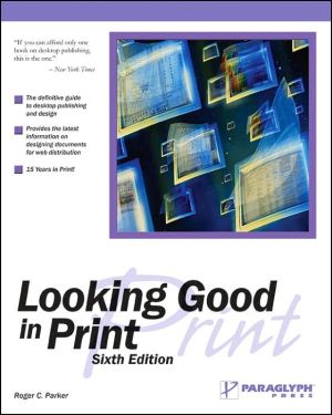
Looking Good in Print
Looking Good in Print, Sixth Edition, is the bestselling designer's guide for creating print documents using the newest desktop publishing technologies. It provides expert advice and invaluable techniques for the desktop publisher. This updated edition features special sections on working with large documents, distribution documents, and developing documents that can easily be updated and modified as well as techniques for using fonts and a variety of type styles, placement of photos and...
Search in google:
Beginner to advanced designers who need a comprehensive design reference PC Week Looking Good in Print is an excellent and valuable resource.
Chapter 6: Do It In Color\ The first question to ask yourself when considering color is not how to use it out whether to use it at all. Nearly any document can benefit from the use of color, if it's applied properly. The size of your budget is the primary consideration. Using color bumps up the printing costs, and although it's not as expensive as it used to be, it's still not a decision to be taken lightly.\ Some documents require color-for example, a black-and-white clothing store catalog wouldn't be much use to potential customers, but most documents won't have this sort of built-in mandate, so you'll need to ask yourself some questions:\ \ Can I afford to use color? If you can't afford to use color, and you don't have an idea for its use that's earth -shattering enough to prompt a budget rearrangement, forget about it. Don't despair. Black-and-white isn't without its charm. Why do you suppose photographers still use it, with color film available just as cheap?\ Does my document really require the added impact or beauty provided by color? This may seem like an odd question, but certain documents are pretty bland by nature, and you probably won't lose much by forgoing color-your readers won't be particularly disappointed by its absence.\ Will my document have to compete with color documents? If you're printing black-and-white product brochures while everyone else in the industry is using color, you may be at a distinct disadvantage. When readers expect color, its absence becomes a liability. Of course, a well-designed black-and-white document will still beat a shoddy color document.\ Which page elements would I set in color? After determining a set of elements to be "colorized," you might discover that your document would include several pages displaying no color at all or in amounts too negligible to draw much attention. Printing essentially black-and-white pages in full color doesn't give you much bang for your buck.\ How many different colors would I need? If you could limit yourself to two colors, for instance the printing cost would be cheaper than for full-color work. Don't forget to count black, if you're planning on using it.\ \ Choosing Colors\ Successful color documents follow a color scheme. \ Okay, so you've decided to use color in your document. The next question you must address is which colors to use. This is not merely a question for jobs involving user-chosen ink colors; even if you're printing in full color, you're going to need a color scheme. Two colors that look nice by themselves might look horrid when used together. Appropriateness is also a factor-certain colors evoke moods which might not fit your document's intended message. Finally, like all other design tools, color is susceptible to overuse. If you shove every color of the rainbow onto a single page, your reader is more apt to be nauseated than impressed.\ Finding A Color Scheme\ Color wheels show relationships between colors and can be a help when devising a color scheme. The color wheel familiar to most people uses red, yellow, and blue as the primary colors from which all other colors are mixed. Colors that result from mixing two primary colors are called secondary colors-for example, the primary colors red and yellow combine to create the secondary color orange.\ A safe way to generate a color scheme is to pick a set of analogous colors-three or four adjacent colors on the wheel. The similarity between analogous colors gives them a good chance of working well together. They tend to create a unified look, albeit one with little color contrast.\ If you crave contrast, you could choose colors located opposite each other on the color wheel, known as complementary colors. (The name is a bit misleading. It's meant to denote two colors that neutralize each other if mixed together. That doesn't necessarily mean they'll complement each other if used together-there are certain red-green combinations I wouldn't even use on a Christmas card.) A better scheme for finding high-contrast colors that work together is to use a triad-three colors roughly equidistant from each other on the color wheel. Red, yellow, and blue are a triad, and they generally work well together.\ Remember, these are just suggestions on how to get started. They're particularly useful if there's one color you know you want to use. You may generate a set of analogous colors or a triad using your color as a starting point and hit upon a workable scheme faster than you would by just picking colors at random....
1Getting started32Tools of organization233The architecture of type494Building blocks of graphic design735The art of illustration916Working with photographs1217Publications1398Advertisements1639Sales materials18110Business communication19711Response devices : forms, surveys, and coupons21312Designing large documents and publications22313Common pitfalls23514Redesign25715Designing documents for Web distribution283
\ New York Times Book ReviewIf you can afford only one book on desktop publishing, this is the one.\ \ \ \ \ MacWeekA graphic design primer for anyone who wants to design better-looking... desktop-published printed material.\ \ \ PC WeekLooking Good in Print is an excellent and valuable resource.\ \ \ \ \ School Library JournalYA-Not only a must for beginning desktop publishers, this succinct compilation of design basics will also prove useful for more experienced teenaged hackers, clearly setting down instructions for what may have been achieved previously through trial and error or intuition. Focusing on elements such as relevance, consistency, and contrast, Parker steers clear of trendiness and emphasizes functionality in his description of and formulae for ``looking good.'' On nearly every page, visual or textual examples demonstrate how a few clicks of the mouse or command key can make a document difficult to read-and how to fix those problems. Chapters cover the ``Tools of Organization'' (grids, subheads, etc.), the ``Architectures of Type'' (typefaces and kerning), and ``Working with Color.'' Later chapters apply these basics, outlining prototypes for designing newspapers, advertisements, books, and business communications. Because the book is not specific to a particular computer system, it won't become dated quickly.-Jennifer A. Phillips, Carnegie Millon University, Pittsburgh, PA\ \ \ \ \ BooknewsNew edition of a clear and thorough guide to good design for desktop publishers. Advises on directing the reader's eye, choosing images, choosing type, creating balance, and avoiding common mistakes that undermine impact. Annotation c. Book News, Inc., Portland, OR booknews.com\ \
