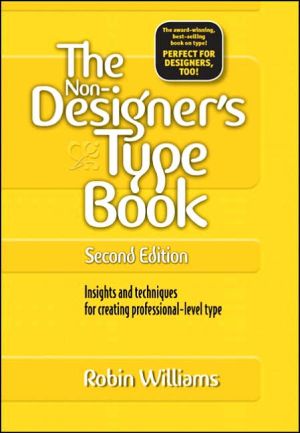
The Non-Designer's Type Book: Insights and Techniques for Creating Professional-Level Type
Seven years is a long time in any industry, but when it comes to the worlds of design and technology (and particularly the point at which the two merge), it's an eternity! No wonder, then, that you (and about a million other readers!) have been eagerly awaiting this latest update to Robin Williams' enormously popular Non-Designer's series. In these pages, Robin defines the principles that govern type as well as the logic behind them so that you learn not just what looks best but why on your...
Search in google:
Seven years is a long time in any industry, but when it comes to the worlds of design and technology (and particularly the point at which the two merge), it's an eternity! No wonder, then, that you (and about a million other readers!) have been eagerly awaiting this latest update to Robin Williams' enormously popular Non-Designer's series. In these pages, Robin defines the principles that govern type as well as the logic behind them so that you learn not just what looks best but why on your way to creating effective print and Web pages. Each short chapter in this thoroughly updated guide (which includes new coverage of typography in Adobe InDesign and Mac OS X) explores a different type secret or technique, including understanding legibility and readability; tailoring typeface to a particular project; mastering pull quotes and captions; working with spacing, punctuation marks, special characters, fonts, and justification; and more. The nonplatform- and nonsoftware-specific approach and Robin's lively, engaging style make this a must-have for any designer's bookshelf! Library Journal Williams teaches electronic typography and has written some excellent books on digital design (e.g., The Non-Designer's Design Book, Peachpit, 1994). Anyone who has misplaced a font they just downloaded from a web site or who has witnessed the horrific use of type on many personal web sites knows how badly these books are needed. Clear explanations and good illustrations are the hallmarks of both volumes. There is little overlap, since one deals with managing the electronic fonts and the other with the uses of type. These gems are recommended for most collections.
\ \ The Joshua Tree Principle\ This short chapter explains the four basic principles in general, each of which will be explained in detail in the following chapters. But first I want to tell you a little story that made me realize the importance of being able to name things, since naming these principles is the key to power over them.\ Many years ago I received a tree identification book for Christmas. I was at my parents' home, and after all the gifts had been opened I decided to go out and identify the trees in the neighborhood. Before I went out, I read through part of the book. The first tree in the book was the Joshua tree because it only took two clues to identify it. Now the Joshua tree is a really weird-looking tree and I looked at that picture and said to my- self "Oh, we don't have that kind of tree in Northern California. That is a weird-looking tree. I would know if I saw that tree, and I've never seen one before." So I took my book and went outside. My parents lived in a cul-de-sac of six homes. Four of those homes had Joshua trees in the front yard. I had lived in that house for thirteen years, and I had never seen a Joshua tree. I took a walk around the block, and there must have been a sale at the nursery when everyone was landscaping their new homes -at least 80 percent of the homes had Joshua trees in the front yards. And I had never seen one before! Once I was conscious of the tree, once I could name it, I saw it everywhere. Which is exactly my point. Once you can name something, you're conscious of it. You have power over it. You own it. You're in control.\ So now you're going to learn the names of several design principles. And you are going to be in control of your pages.\ The four basic principles\ The following is a brief overview of the principles. Although I discuss each of these separately, keep in mind they are really interconnected, Rarely will you apply only one principle. \ Contrast\ The idea behind contrast is to avoid elements on the page that are merely similar. If the elements (type, color, size, line thickness, shape, space, etc.) are not the same, then make them very different. Contrast is often the most important visual attraction on a page.\ Repetition\ Repeat visual elements of the design throughout the piece. You can repeat color, shape, texture, spatial relationships, line thicknesses, sizes, etc. This helps develop the organization and strengthens the unity.\ Alignment\ Nothing should be placed on the page arbitrarily. Every element should have some visual connection with another element on the page. This creates a clean, sophisticated, fresh took,\ Proximity\ Items relating to each other should be grouped close together. When several items are in close proximity to each other, they become one visual unit rather than several separate units. This helps organize information and reduces clutter.\ Umm . . .\ When culling these principles from the vast morass of design theory, I thought there must be some appropriate and memorable acronym within these conceptual ideas that would help people remember them. Well, uh, there is a memorable-but very inappropriate- acronym. Sorry.
What is typography, anyway?A brief history of type19Readability and legibility31Punctuation51Expert type77Spacing105Details125Special effects149Typographic choices171Glossary of type terms207Other info217App. AListen to your eyes218App. BFont and product vendors225App. CSpecial characters227
\ From Barnes & Noble\ \ Fatbrain Review\ Most experienced designers agree: though HTML offers unlimited opportunities to present information, it is a lousy place to learn design techniques, and all too often publishers let HTML limitations dictate pages that are ugly, boring and difficult to use. Don't be boxed in by HTML -- set your creativity free by learning basic design principles to use in creating innovative Web pages. This is the book recommended to teach even the visually-impaired the basics of layout and design, and it's drawn rave reviews from the Webmasters who frequent Web publishing newsgroups. One reader said "Most Web page design books just teach you various tricks and never teach you how to think and see. Robin's book talks about the basic principles which are equally applicable in We! b pages." Learn how to organize information effectively, the best typefaces to drive home your page's message, which colors and backgrounds are best for your needs and other basics of design, invaluable background for anyone hoping to create distinctive pages on the Web. If your design eye could use some refining, The Non-Designer's Design Book is the book you need.\ \ \ \ \ Library JournalWilliams teaches electronic typography and has written some excellent books on digital design (e.g., The Non-Designer's Design Book, Peachpit, 1994). Anyone who has misplaced a font they just downloaded from a web site or who has witnessed the horrific use of type on many personal web sites knows how badly these books are needed. Clear explanations and good illustrations are the hallmarks of both volumes. There is little overlap, since one deals with managing the electronic fonts and the other with the uses of type. These gems are recommended for most collections.\ \ \ BooknewsWilliams aims to empower desktop publishers and Web page creators with the principles governing sophisticated typography on either Macintosh or Windows platforms. Examples and tips galore train the eyes to appreciate the finer types. Parts of this book were originally published as . Annotation c. by Book News, Inc., Portland, Or.\ \


